一个说明
ggplot2::ggplot()指使用ggplot2包中的ggplot函数,::表示快速调用某个包里的函数.
示例
使用ggplot2包中的mpg数据框,这份数据是一份汽车资料:
1 | knitr::kable(head(ggplot2::mpg, 10)) |
| manufacturer | model | displ | year | cyl | trans | drv | cty | hwy | fl | class |
|---|---|---|---|---|---|---|---|---|---|---|
| audi | a4 | 1.8 | 1999 | 4 | auto(l5) | f | 18 | 29 | p | compact |
| audi | a4 | 1.8 | 1999 | 4 | manual(m5) | f | 21 | 29 | p | compact |
| audi | a4 | 2.0 | 2008 | 4 | manual(m6) | f | 20 | 31 | p | compact |
| audi | a4 | 2.0 | 2008 | 4 | auto(av) | f | 21 | 30 | p | compact |
| audi | a4 | 2.8 | 1999 | 6 | auto(l5) | f | 16 | 26 | p | compact |
| audi | a4 | 2.8 | 1999 | 6 | manual(m5) | f | 18 | 26 | p | compact |
| audi | a4 | 3.1 | 2008 | 6 | auto(av) | f | 18 | 27 | p | compact |
| audi | a4 quattro | 1.8 | 1999 | 4 | manual(m5) | 4 | 18 | 26 | p | compact |
| audi | a4 quattro | 1.8 | 1999 | 4 | auto(l5) | 4 | 16 | 25 | p | compact |
| audi | a4 quattro | 2.0 | 2008 | 4 | manual(m6) | 4 | 20 | 28 | p | compact |
创建ggplot2图形,散点图:
1 | ggplot(data = mpg) + |
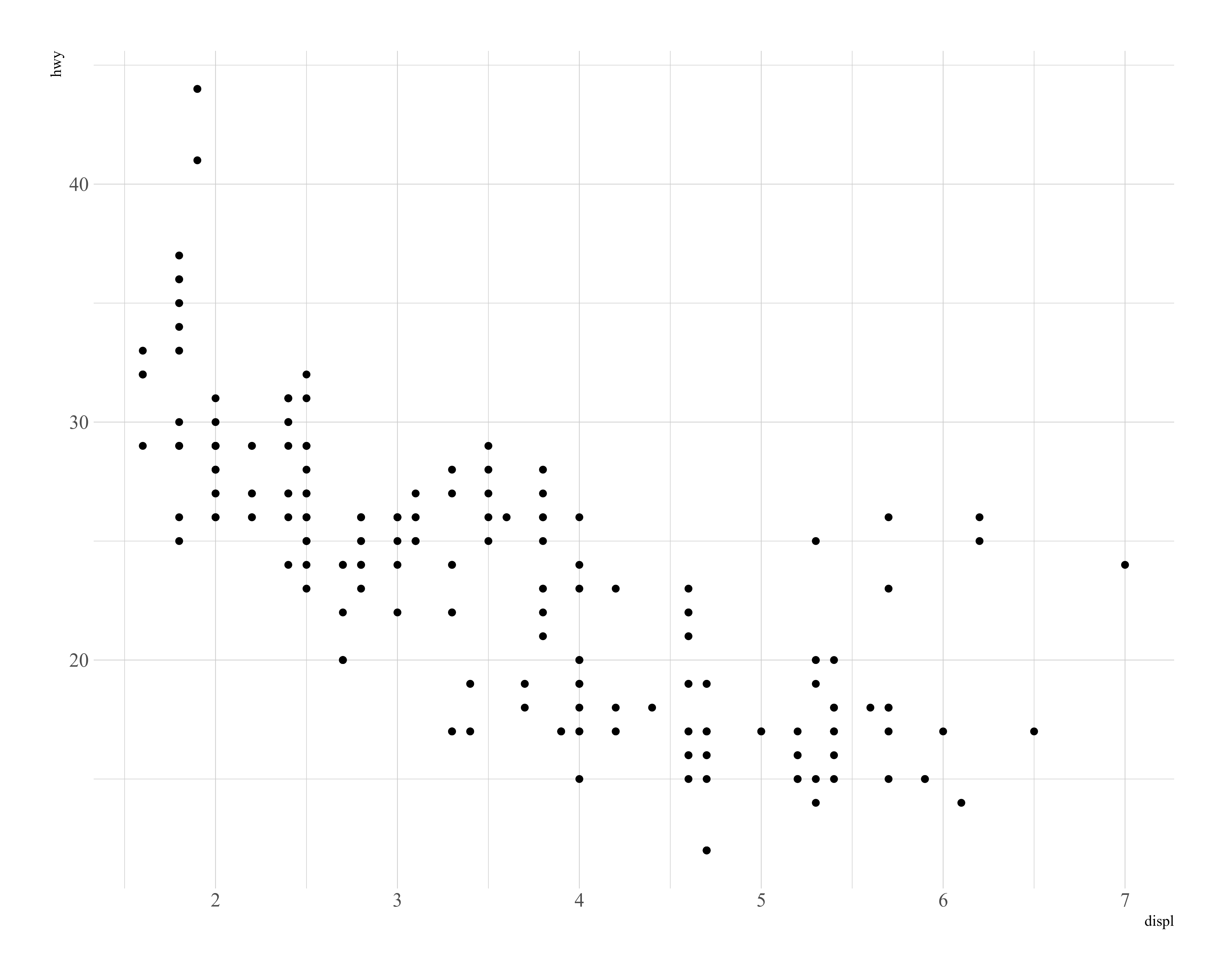
其中mapping是映射的意思,在ggplot()的()中出现的内容将传递之后的绘图函数,p保存了绘制好的图形,可以进一步进行美化和调整:
1 | p + theme_minimal(base_family = enfont) + |
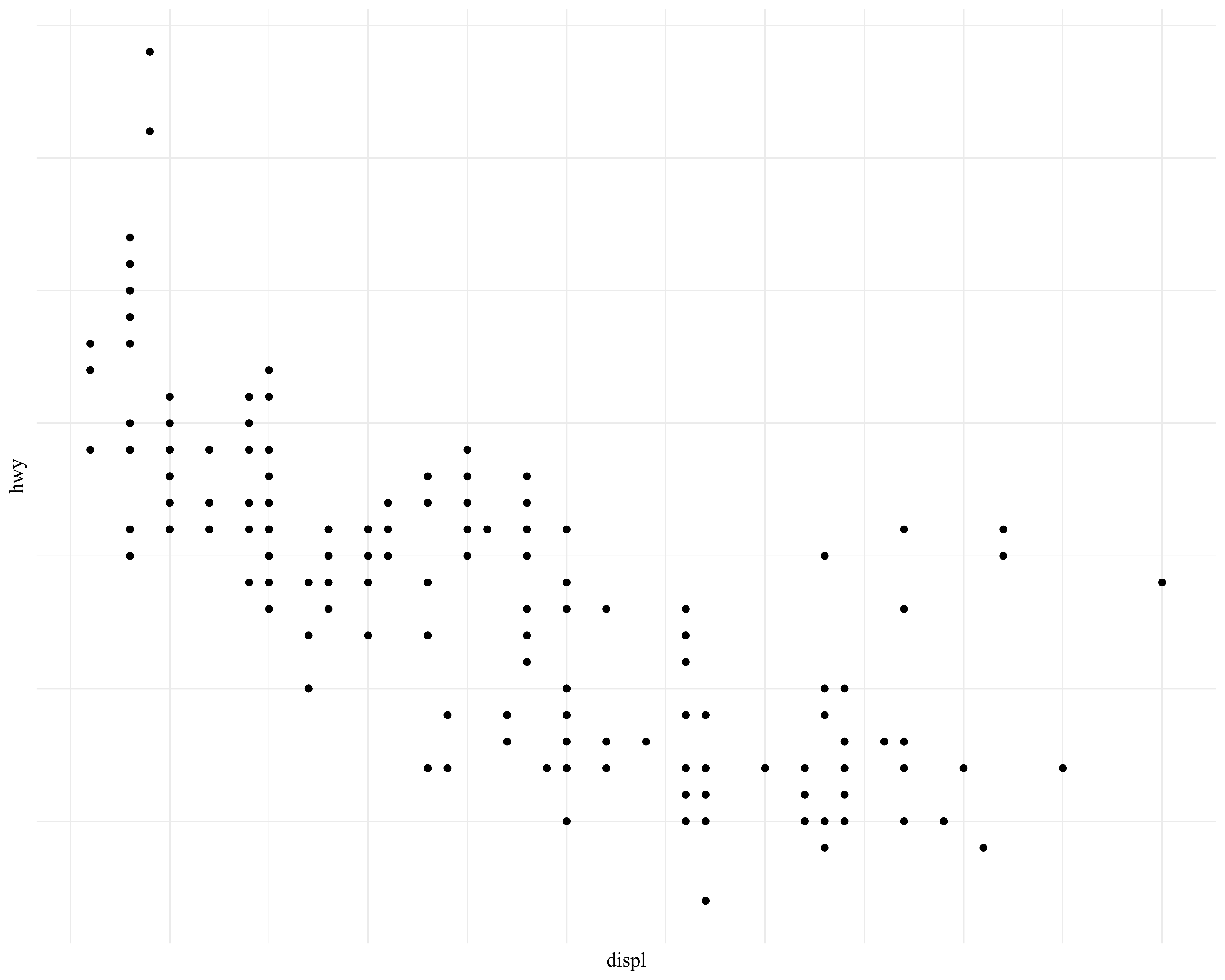 可以将一些图片调整的代码存放在
modify命名的一个对象中:
1 | theme_minimal(base_family = enfont) + |
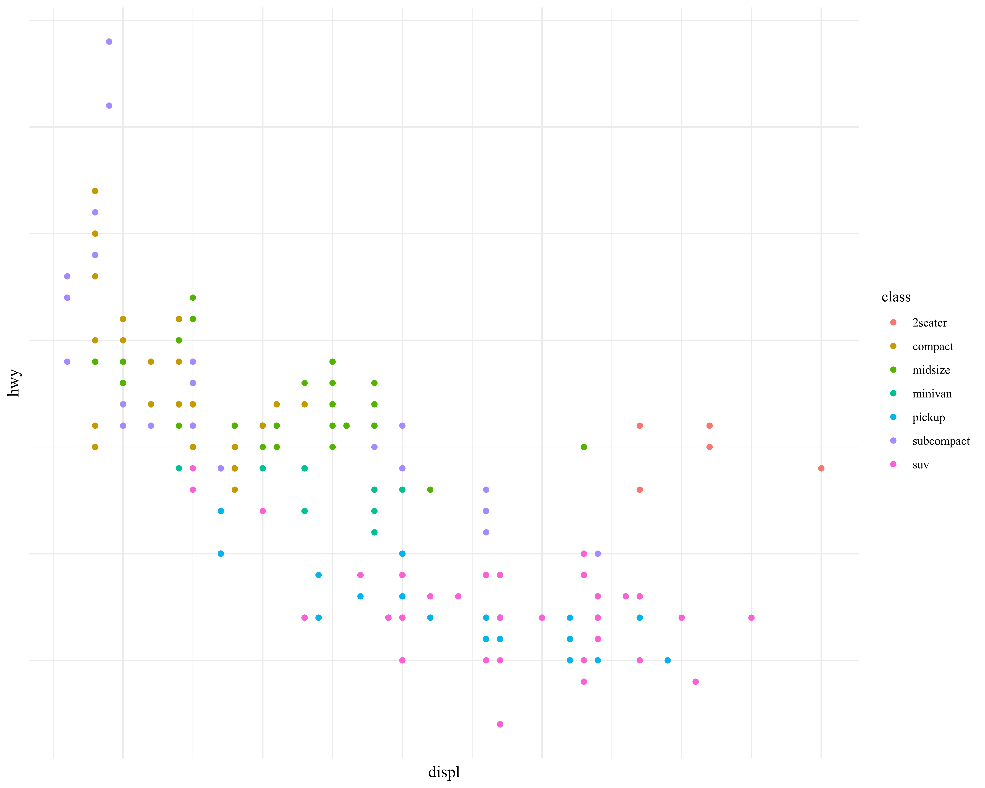
实际上,ggplot2的魅力之一在于通过颜色(color)、形状(shape)、透明度(alpha)等等属性展示超越2维的信息,比如:
1 | ggplot(data = mpg) + |
另外一种展示超越2维属性的方法就是分面:
1 | ggplot(data = mpg) + |
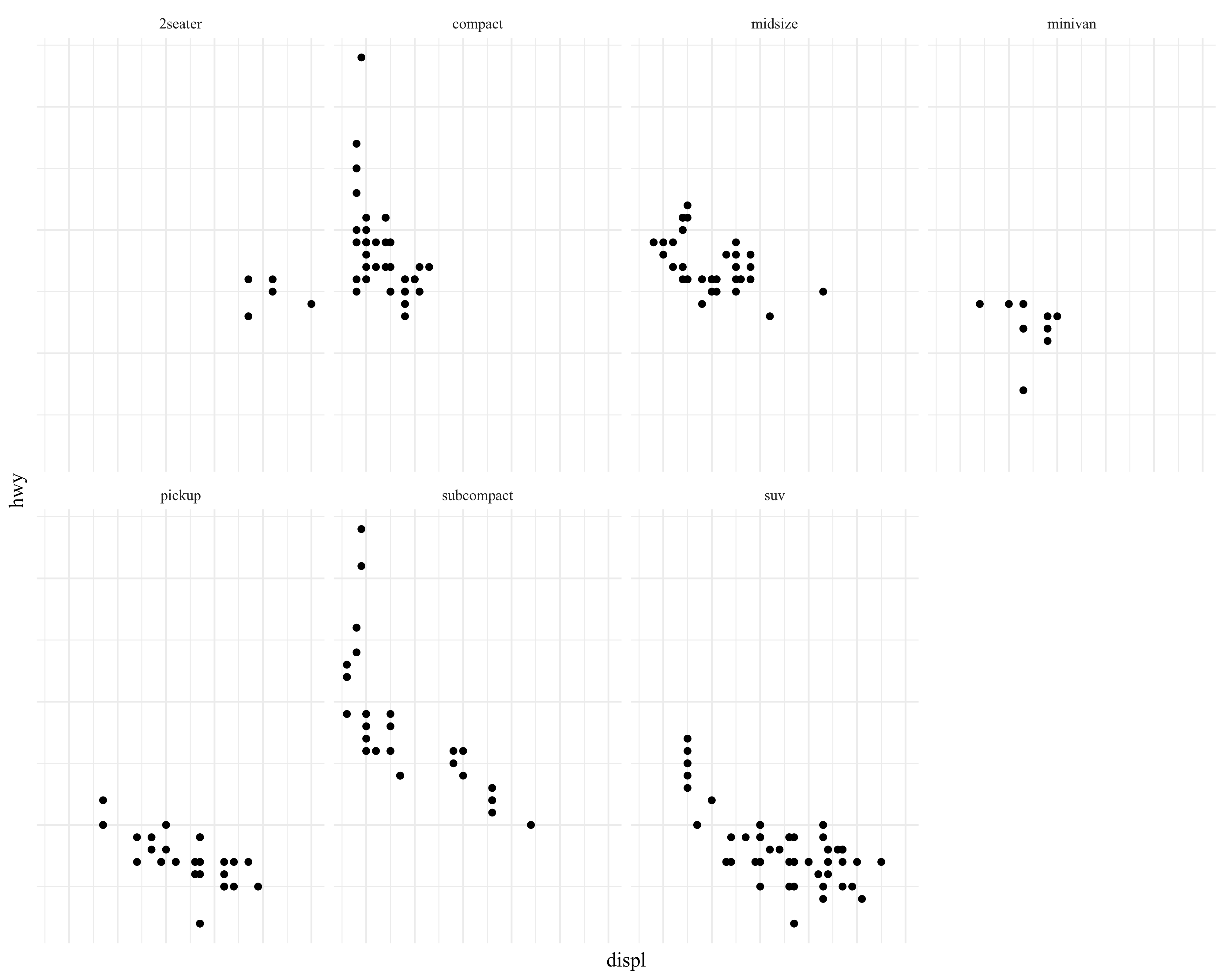
facet_wrap()中的第一个参数是R中的一种数据结构,叫作"公式",并非数学意义上的意思.也可以使用2个变量进行分面:
1 | ggplot(data = mpg) + |
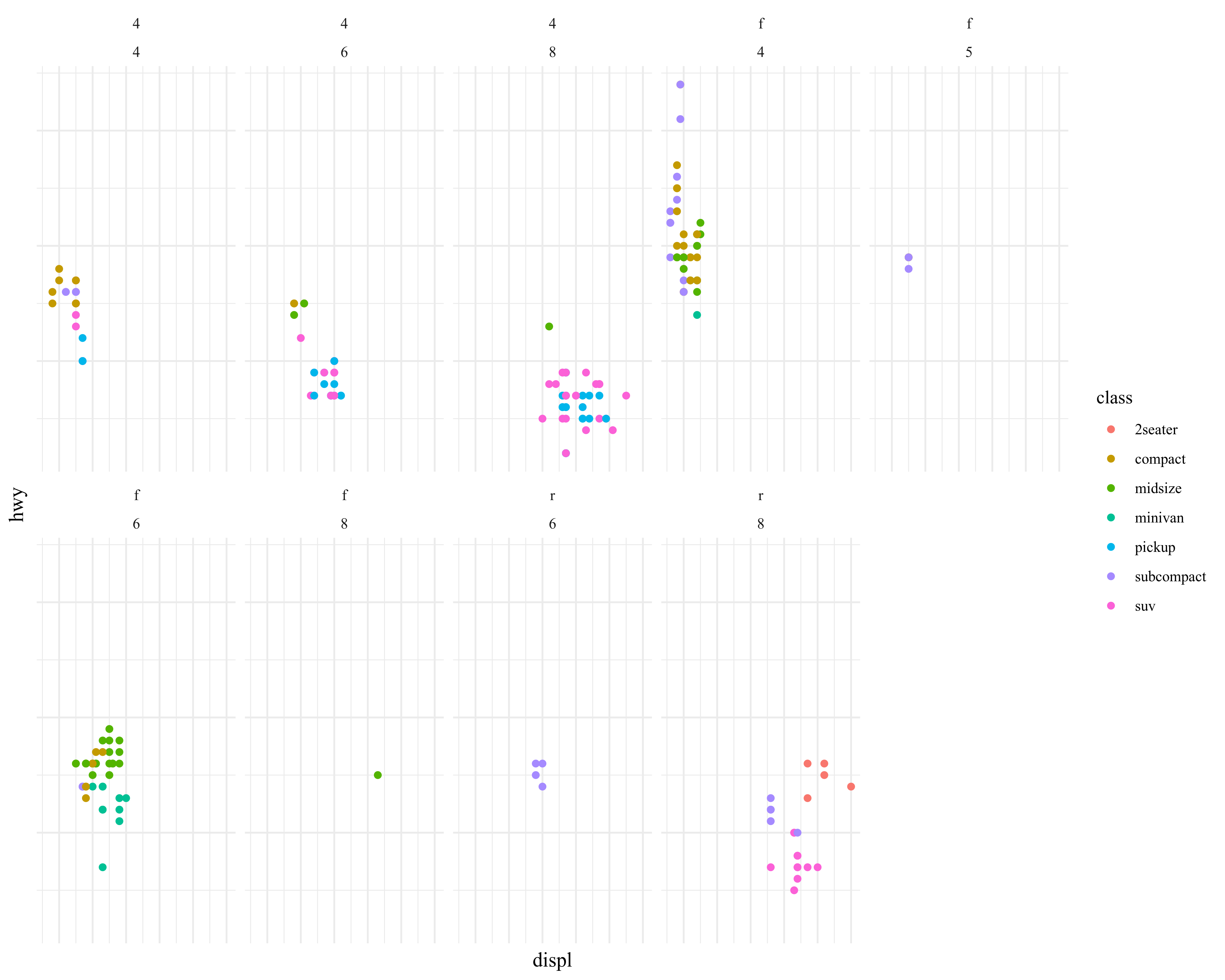
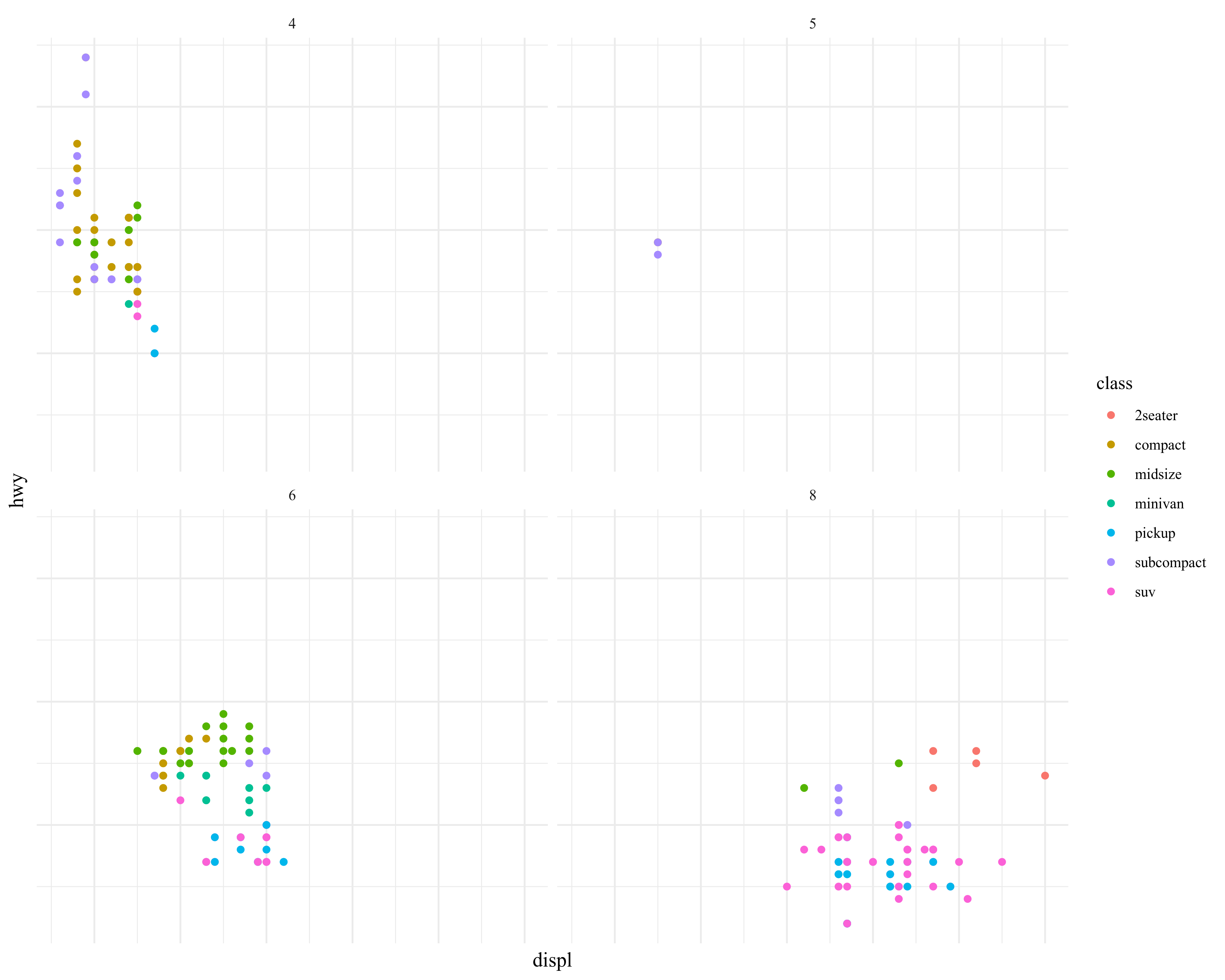
可以使用占位符.来代替facet_wrap()第一个参数中的drv,效果如下:
1 | ggplot(data = mpg) + |
几何对象
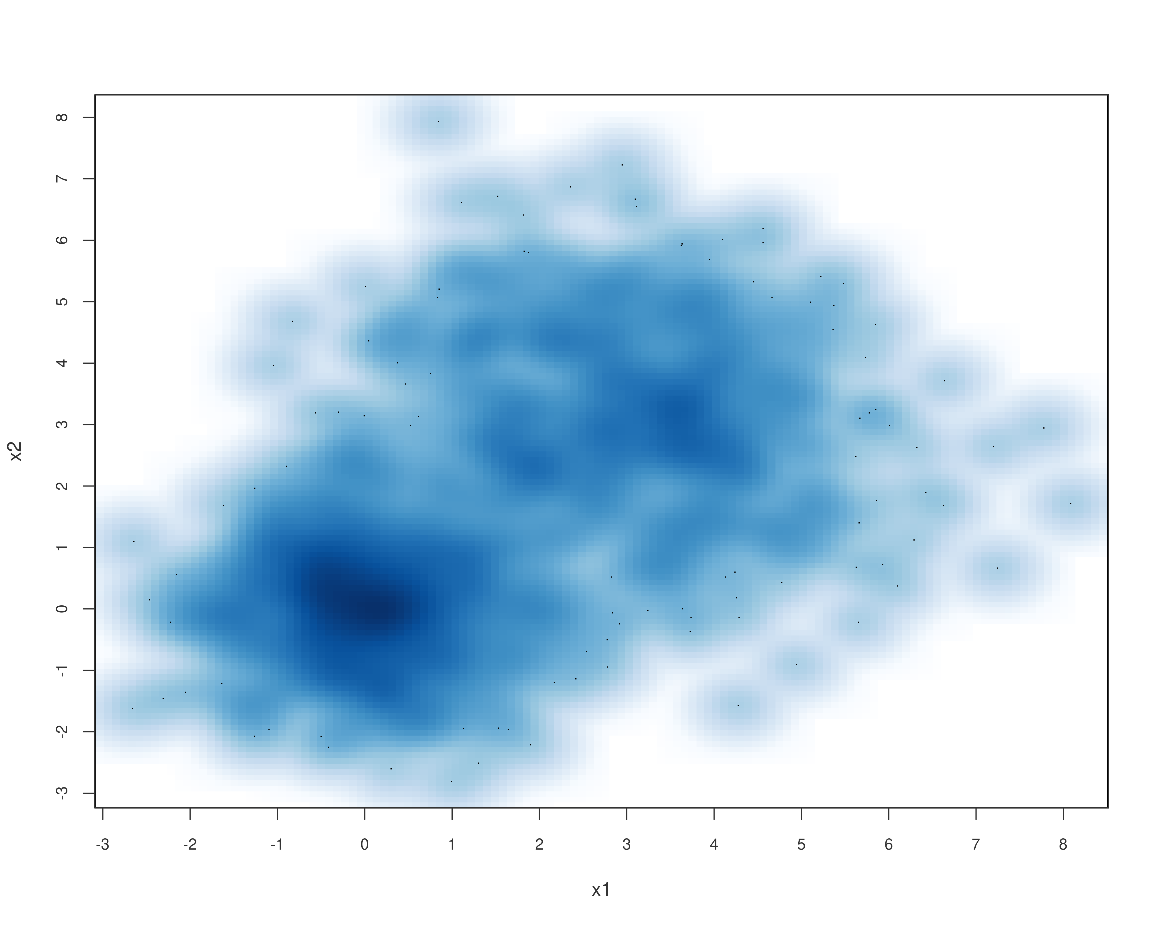
R并非只有ggplot2一种绘图方案,比如:
1 | set.seed(123) |
1 | #> [,1] [,2] |
1 | smoothScatter(x, xlab = "x1", ylab = "x2") |
而ggplot2肯定并非只有一类几何对象,比如geom_smooth、geom_line、geom_bar等等,而这些对象生成的图层可以堆叠,比如:
1 | ggplot(data = mpg) + |
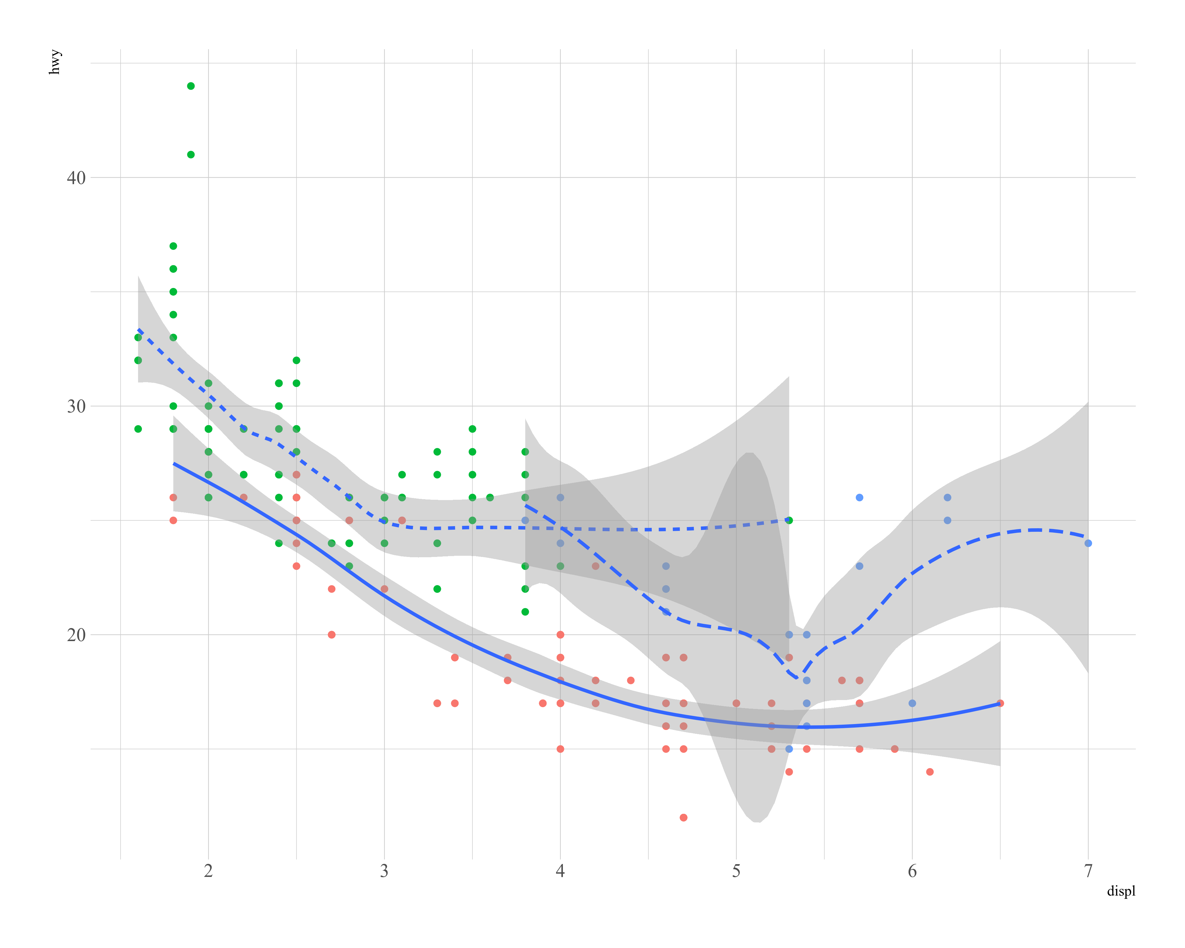
geom_smooth()使用单个几何对象表示多行数据(一条曲线),而geom_bar()和geom_point则是多个几何对象(多个矩形或点),将geom_smooth()的group属性映射为一个离散变量时,这样ggplot2就会为这个分类变量的每个唯一值绘制一个独立的几何对象.
1 | ggplot(data = mpg) + |
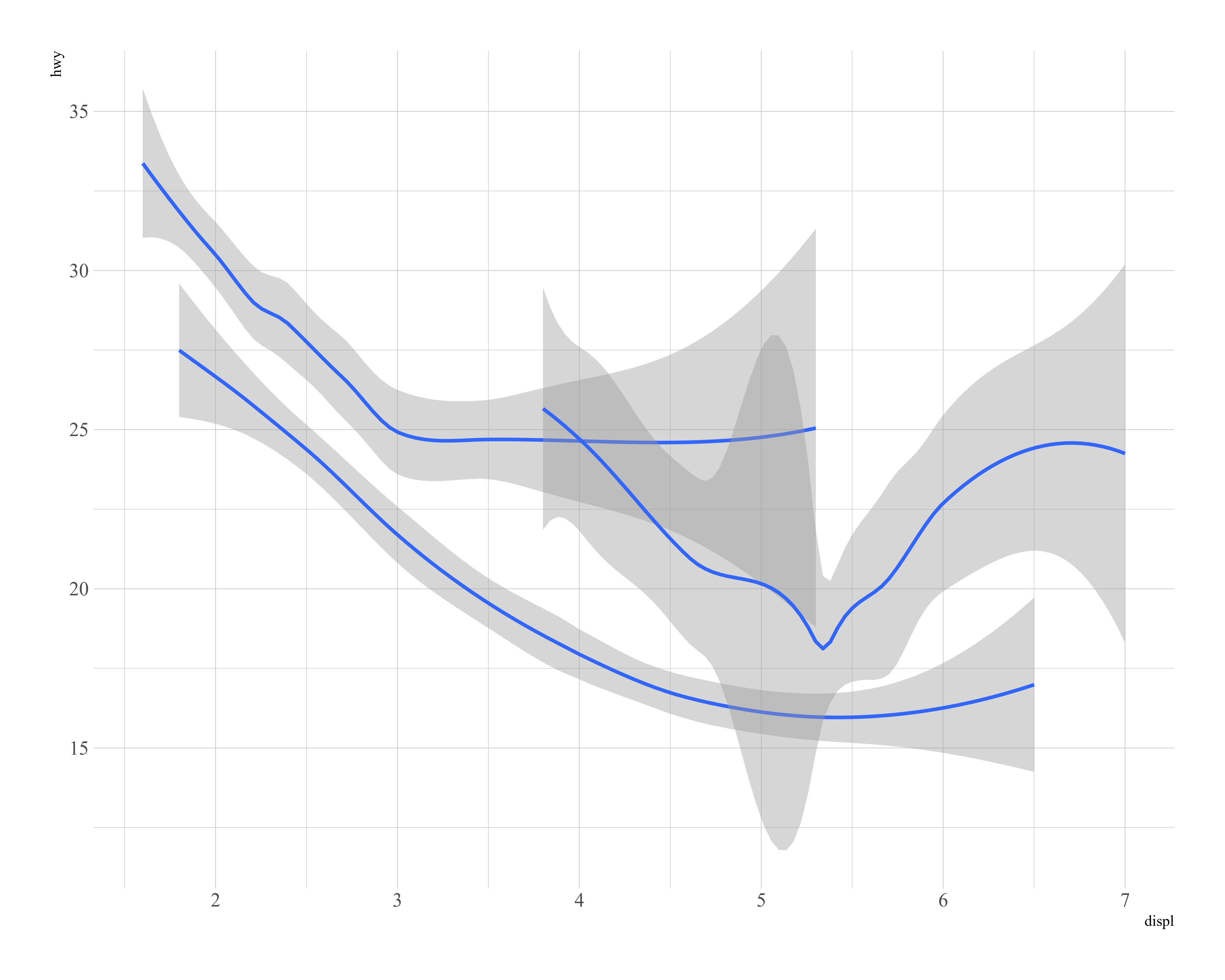
也可以为不同的图层指定不同的数据:
1 | ggplot(data = mpg) + |
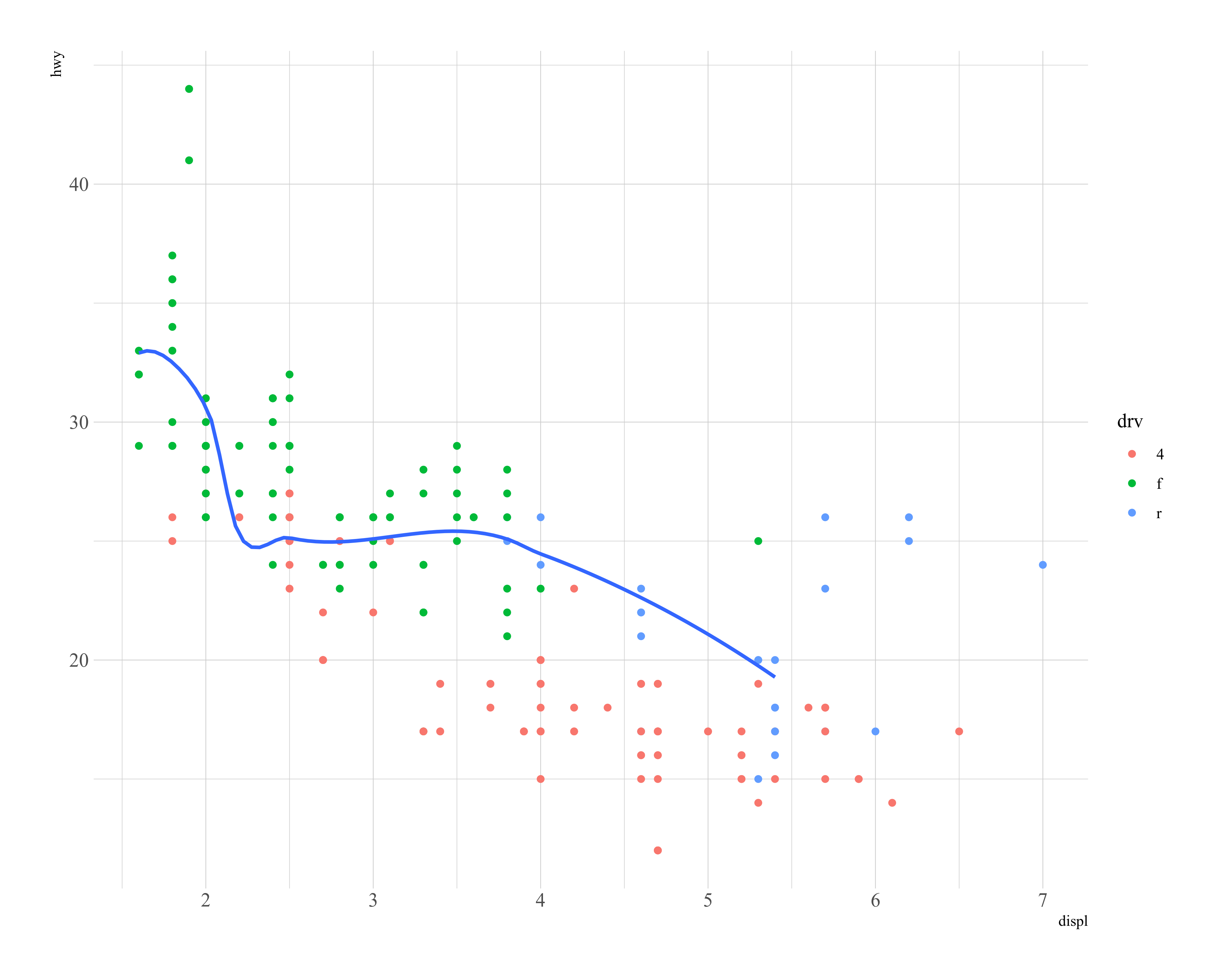
统计变换
geom_bar()函数可以绘制的基本条形图.
1 | ggplot(data = diamonds) + |
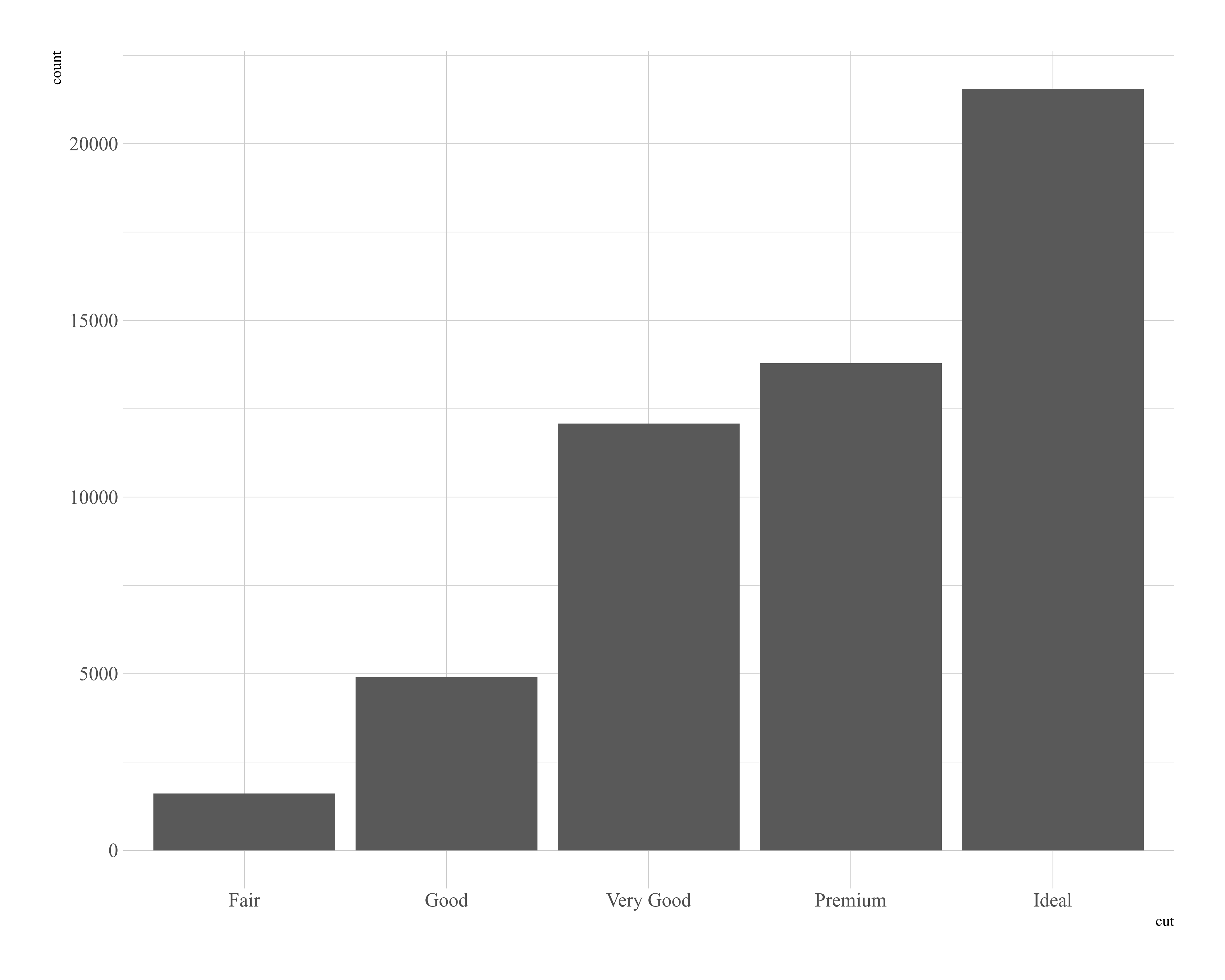
条形图 x 轴显示的是 cut ,这是 diamonds 数据集中的一个变量. y 轴显示的是 count ,但 count 不是 diamonds 中的变量! count 来自哪里呢?很多图形绘制的是数据集的原始数据,比如散点图.另外一些图形则可以绘制那些计算出的新数据,比如条形图.
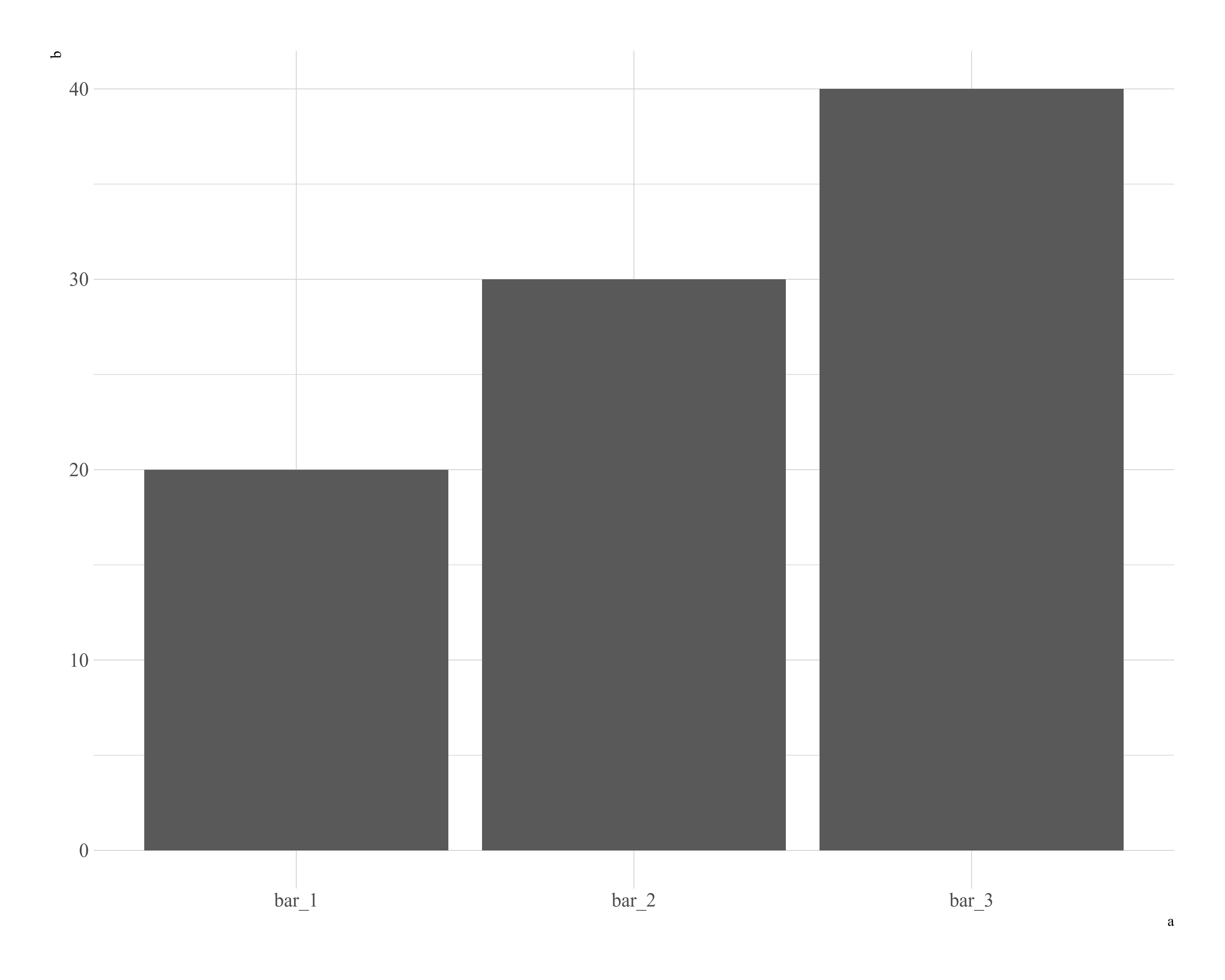
绘图时用来计算新数据的算法称为stat(statistical transformation),即统计变换.你可能想要覆盖默认的统计变换.在以下代码中,我们将geom_bar()函数的统计变换从计数(默认值)修改为标识.这样我们就可以将条形的高度映射为y轴变量的初始值.遗憾的是,当随意说起条形图时,人们指的可能就是这种条形图,其中条形高度已经存在于数据中,而不是像前一个图一样,条形高度由对行进行计数来生成:
1 | demo <- tribble( |
也可以改变统计变换的默认映射:
1 | ggplot(data = diamonds) + |
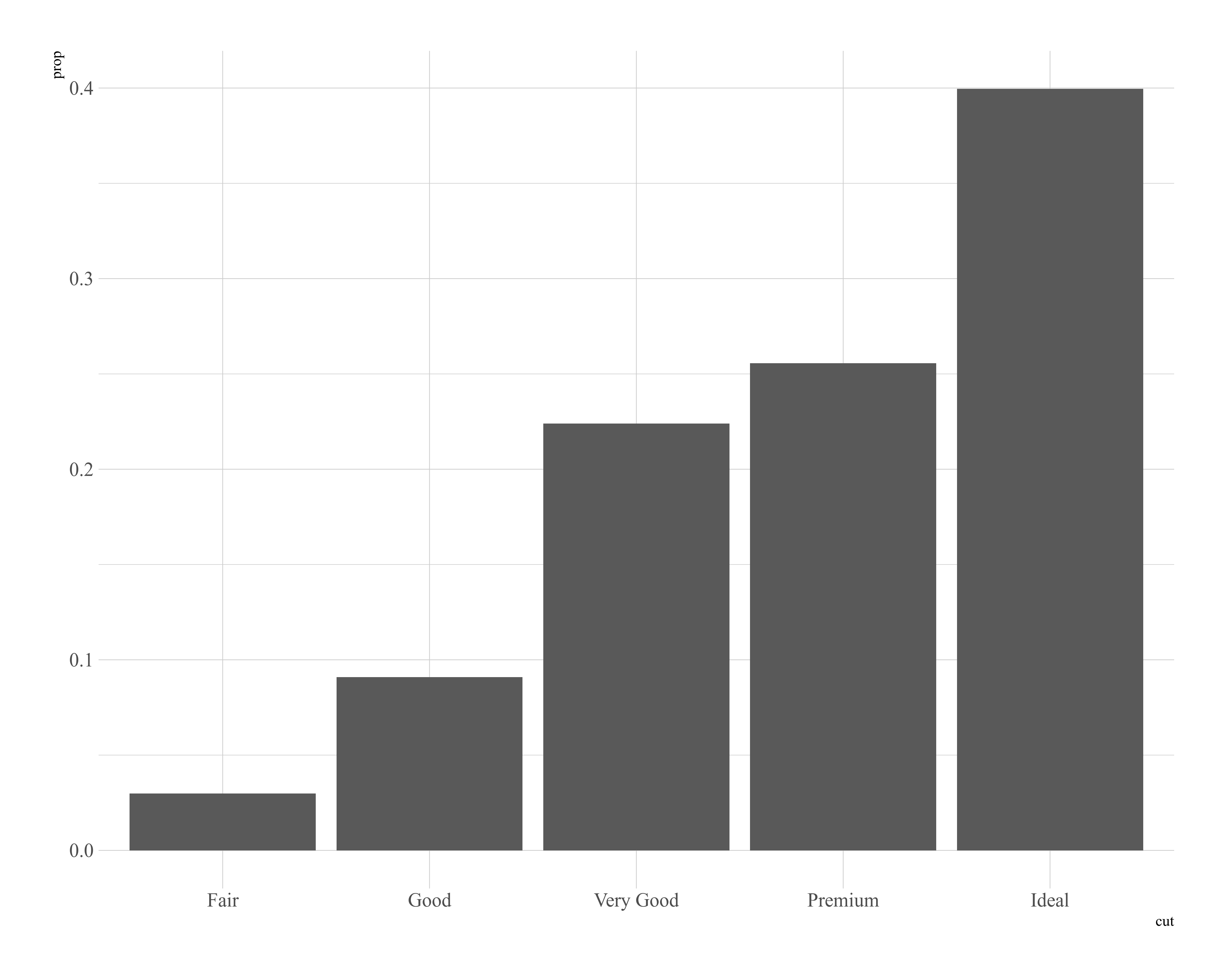
你可能想要在代码中强调统计变换.例如,你可以使用stat_summary()函数将人们的注意力吸引到你计算出的那些摘要统计量上.stat_summary()函数为x的每个唯一值计算y值的摘要统计:
1 | ggplot(data = diamonds) + |
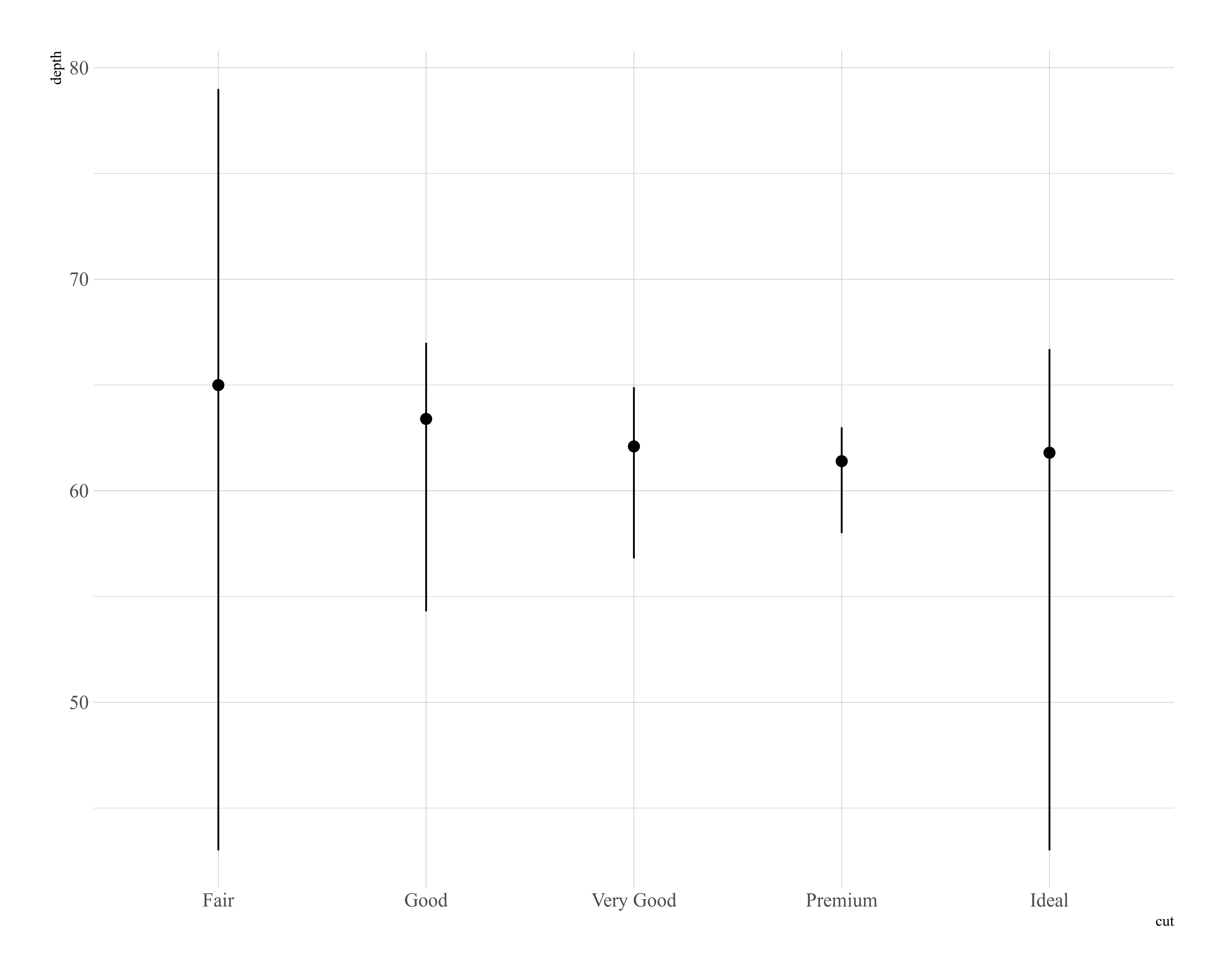
ggplot2提供了20多个统计变换以供你使用.每个统计变换都是一个函数,因此你可以按照通用方式获得帮助,例如?stat_bin